A strong fashion brand starts with positioning, not decoration. Get the story straight first, then type, photography, and retail can do their job.
- Who is this brand really for (today, not five years ago)?
- What cultural space does it occupy between heritage and hype?
- Why should that customer care: what proof do you repeat everywhere?
Positioning is the filter for casting, color, pacing, retail experience, and copy tone. When it stays vague, even expensive production reads generic.
- Write a one-page narrative plus three proof points (lightweight) or run segmentation when stakes are high.
- Revisit positioning each season as calibration, not a panic rebrand, when categories or markets shift.
- Run workshops that open with positioning statements before pixels so feedback is about intent, not taste alone.
Make it explicit enough that a freelancer hired mid-week can still ship on-brand work. That anchor stops teams from chasing trends and losing equity customers feel but rarely name.
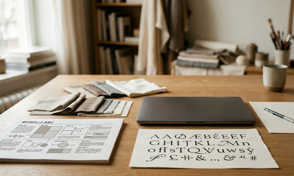
Visual identity should behave like a system, not a one-off mood board. Shared guardrails free energy for storytelling instead of endless basics debates.
- Typography and logo behavior that stay legible at every size you actually use.
- Photography direction and layout rhythm that match lookbooks, e-commerce, paid social, decks, and in-store screens.
- A tone-of-voice sheet marketing and design both pull from: same verbs, same confidence.
Document what not to do: type styles that cheapen the house, filters that lie about product, layout shortcuts that signal commodity. That “negative space” in guidelines keeps premium labels from drifting.
- Treat accessibility as part of luxury: real type sizes, contrast, descriptive alt text.
- When the system aligns, recognition and trust compound: one voice everywhere the customer meets you.
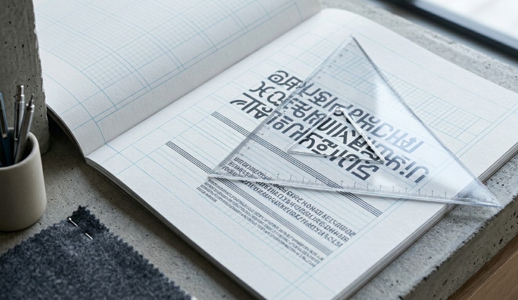
Consistency in premium fashion is not the same as repeating one layout forever. Aim for controlled variation: each drop feels fresh yet unmistakably tied to the same DNA.
- Does the cast feel right for the audience you claimed in positioning?
- Does the product read as true: material, fit, price tier?
- Does the story still feel singular, not like a generic editorial template?
- Does art direction still feel like this house on warm close-ups and cooler, faster seasons alike?
Name those principles out loud for photographers, stylists, and agencies so briefs drift less and reshoots drop. Visual memory in the market is a durable edge for smaller labels.
Wholesale partners notice coherent decks too: they shorten explanation and make sell-in stories easier to repeat in their regions.
Teams that capture decisions in writing move faster than teams that relitigate aesthetics every milestone. Invest in narrative clarity, product truth, and channel fit, not endless opinion loops.
- Shorter approval cycles and fewer emergency re-edits.
- Higher campaign recall and cleaner product pages.
- Stronger wholesale storytelling when the same proof points travel intact.
Train with concrete on-brand and off-brand examples so newcomers internalize judgment, not only rules. One searchable home for docs keeps remote staff and seasonal freelancers aligned with the voice you spent years earning.
Whether you are in-house or consulting, the discipline matches: anchor creativity in positioning, then let visual identity carry that story with precision across every touchpoint shoppers actually see.